Querying and Visualising OctoDNS records with Neo4j
Visualising DNS records with Neo4j
OctoDNS provides a toolset for managing DNS records across multiple providers. Built by Github and using a typical YAML structure, to describe what a DNS zone should look like. The example taken from the getting-started section of the repo, describes what an A record at example.com looks like.
---
'':
  ttl: 60
  type: A
  values:
  - 1.2.3.4
  - 1.2.3.5
Neo4j is a graph database platform, which focuses on the relationships between data records. Using its own query language, cypher, Neo4j makes it easy to visualise graphs and explore the relationships of your data.
Why ?
Declarative configuration is about treating infrastructure as data, which is more portable than code, and enables workflows that manipulate desired state based on policy, while serializing the results between each step of the pipeline.
The declarative nature of OctoDNS, allows us to treat the config as data. We can then query our data and ask all sorts of questions about the relationships in our DNS records. My preferred tool of choice here is Neo4j as it provides a way to visualise these relationships out of box.
We can explore patterns, relationships, and overall develop intuition. From threat modelling sessions, as a starting point for intel gathering, finding dangling domain records for bug bounties, or to understand the components that engineers used in order to build the system.
In systems that make use of more than one platform or tech stack, the question of "where does this thing point to ", comes up frequently.
E.g., where does this run[1] and what is this[2] ?
Finally by visualising and having a picture might not always be worth a thousand words, but it will definitely complement them.
How ?
We will parse the zone config in YAML. As an example we will use the zone config of k8s.io, and extract the zone records, and values. For the purposes of this, I only care about A and CNAME records. We will then try and enrich the data. Specifically, I'm matching IP ranges to vendors. This way I can identify if an A record belongs to Google or some other vendor. These IP ranges are published by GCP, AWS, etc. For example, these are the IP ranges for GCP.
Results
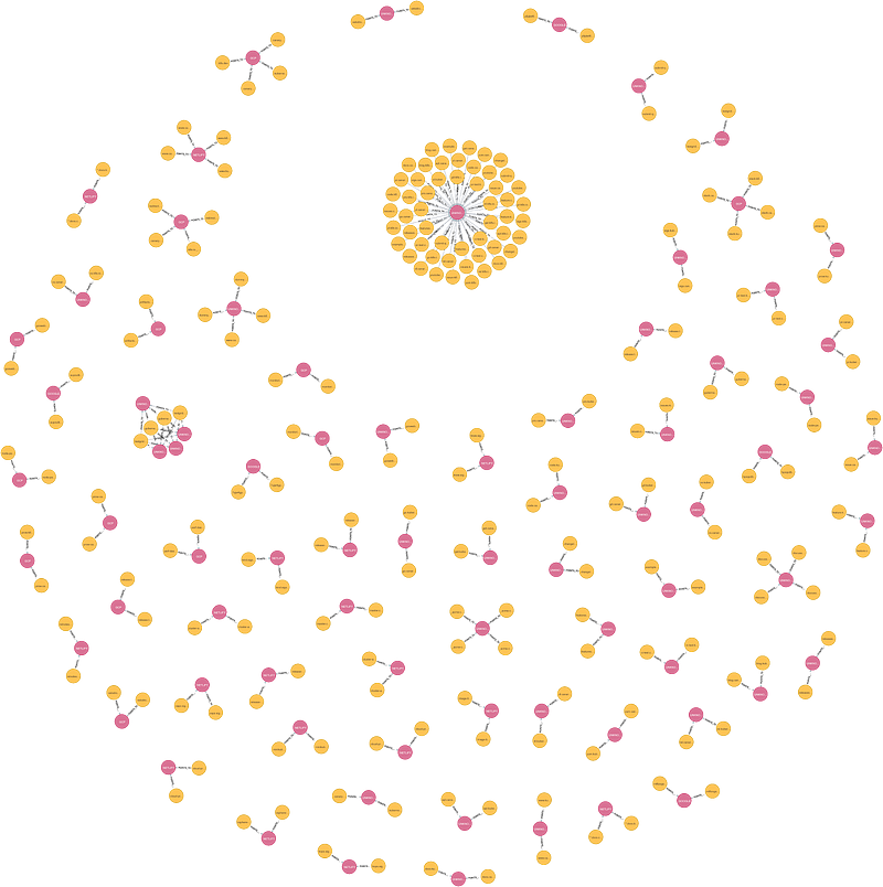
This is what the whole graph for k8s.io zones looks like. The nodes in yellow are the zone records, the nodes in pink are the values. There is only one relationship type "POINTS_TO". In other words a node in yellow will be "k8s.io" and the node in pink will be "34.107.204.206"
Most nodes come in triplets. This is because the canary release and the live release point to the same value.
$dig +short k8s.io
34.107.204.206
$dig +short canary.k8s.io
34.107.204.206
Owner

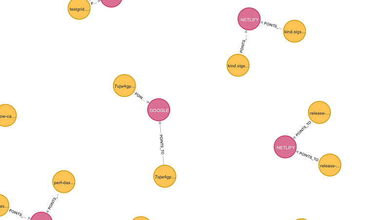
The data enrich helps us identify the owner of the zone record. Doing a summary, 38 of k8s.io's records point to Netlify domains.
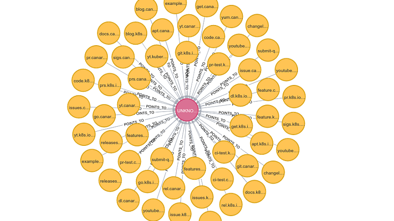
Finally the large cluster in the middle points to redirect.k8s.io .
Where do we go now?
This pattern, of treating configuration as data, is already being used in kubernetes clusters, see https://github.com/spekt8/spekt8. But we can extend it further to DNS records,terraform resources, etc.
Visualising structures helps in making sense of higher order concepts. We can even take it a step further and try to visualise every relationship of our infrastructure from DNS record to kubernetes pod.
By treating config as data, we can query it in all sorts of ways. Going back to questions [1] and [2], we know that this isn't running in GCP but we unfortunately still don't know what [2] is!
Try it on your data and let me know what that looks like.
You can find the repo to try the above on your own here.
By Costas Kourmpoglou{.p-author .h-card} on September 19, 2020.
Canonical link{.p-canonical}
Exported from Medium on July 3, 2023.


